
Doubling CD-Opening Completion
Redesigned Certificate of Deposit opening end to end, then Renewal, Explore, and mobile.


Context
A business goal, not a design brief
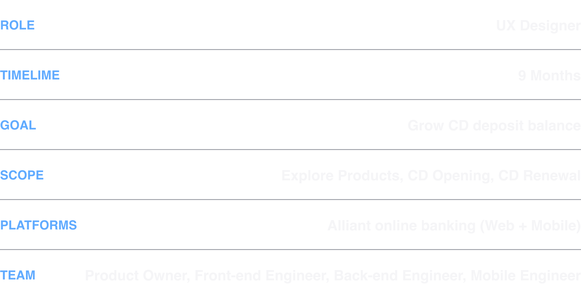
Alliant wanted to grow CD deposit balances. My first job was finding where members were dropping out. I owned the work end to end - problem definition, research, design, prototyping.
Assumed problem
The solution came before the evidence
“Letting members open multiple CDs at once will grow openings.”
- Business Owner
June 2023, a working session - flows for multi-CD opening already going up on the whiteboard. I asked, “Why would that drive more CD openings?” No one had a clear answer.
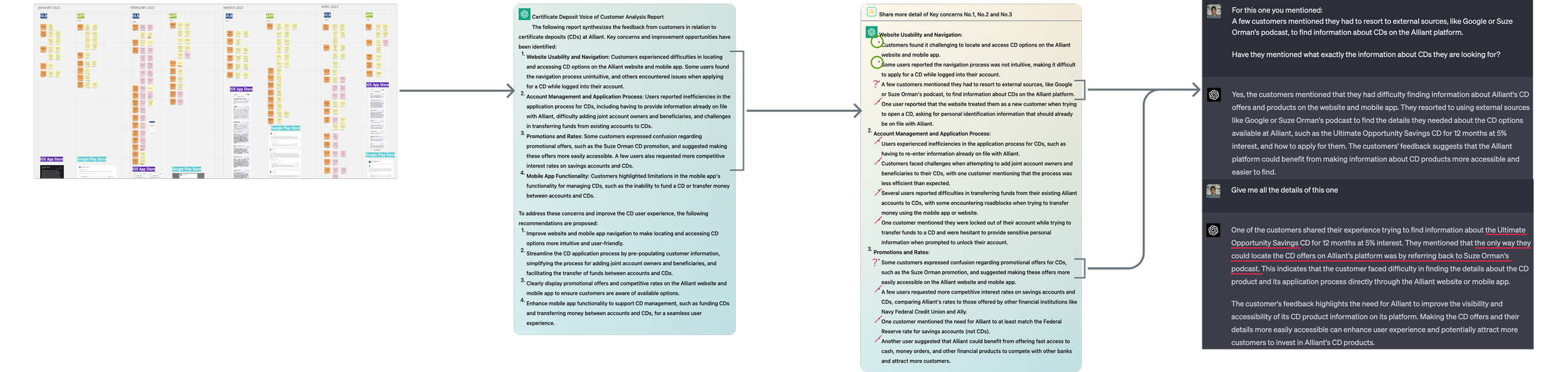
After the meeting, I proposed we verify the assumption behind it. Two weeks of funnel data and VOC clustering showed a different problem.
VOC to insights - complaints clustered on the CD opening flow
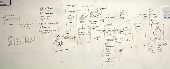
The whiteboard from that June 2023 session
Refined problem
Members couldn't find CD, and fewer than half who did finished it.
Before the flow:
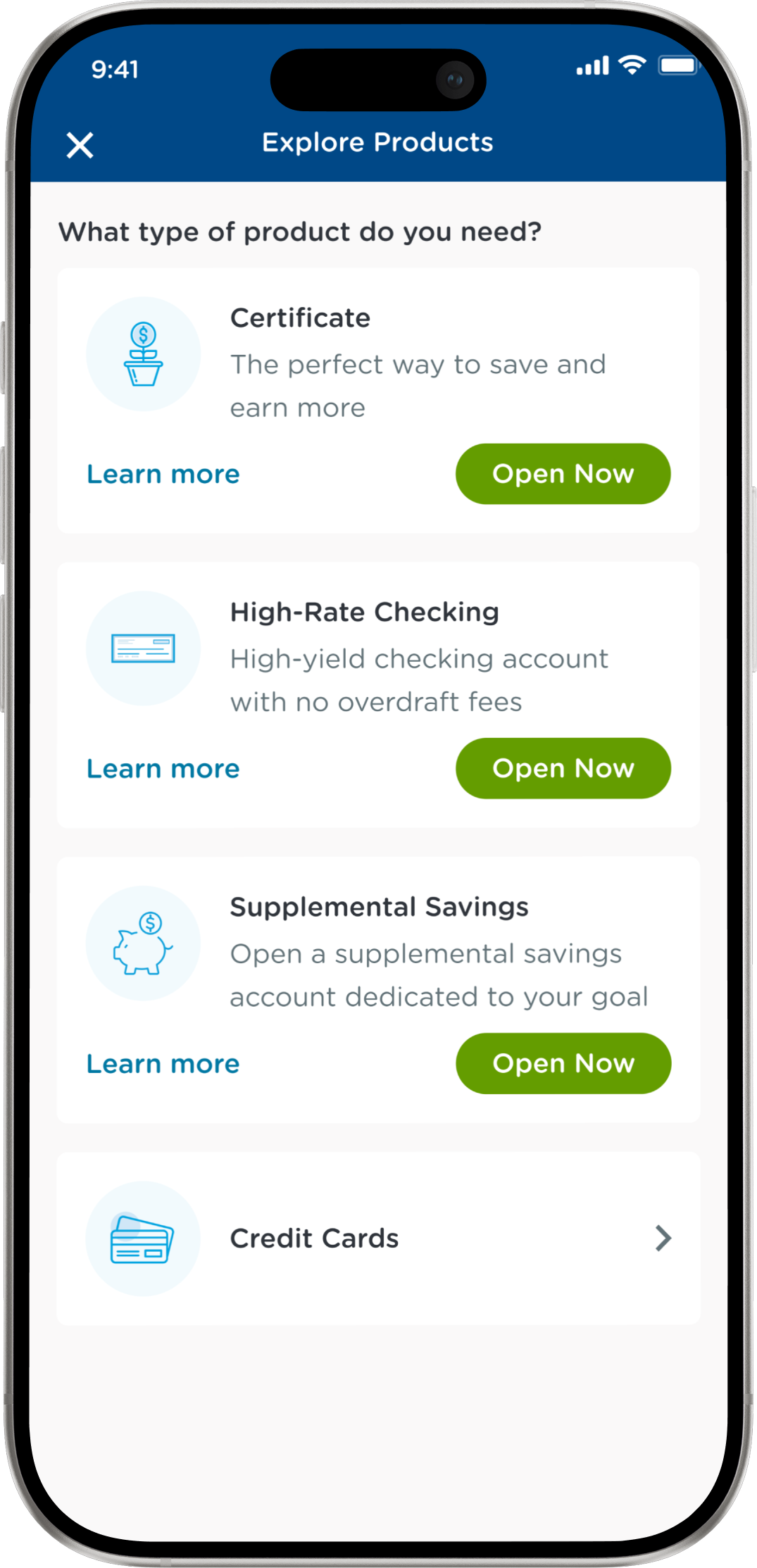
The product was hard to find at all - hard enough that some members questioned whether their money was safe1.
Inside the flow:
Rates lived outside the application2, key options were missing3, and the jargon assumed members already knew the terms4. Only 43% of members who started an application finished it.
From the VOC analysis Jan ~ June 2023 - app store reviews and member feedback. As well as usability testing.
1 · Discovery failure
“Make what you offer easier to find. It makes me wonder if my money is safe because it's so hard to find CD.”
2 · Rates outside the flow
“I had to navigate to a separate area to find the CD rates, outside of the purchase flow, which required me to leave the sign-up process.”
3 · Missing options
“When creating a certificate, my joint account holder does not appear as an available option during the certificate creation process.”
4 · Jargon clause
"There's APY, dividend rate, terms… I can't tell what any of it means for how much I actually get."
Results
The redesigned flow grew completion rate to 80%.
3 approaches to success
2. Trust
1. Simplicity
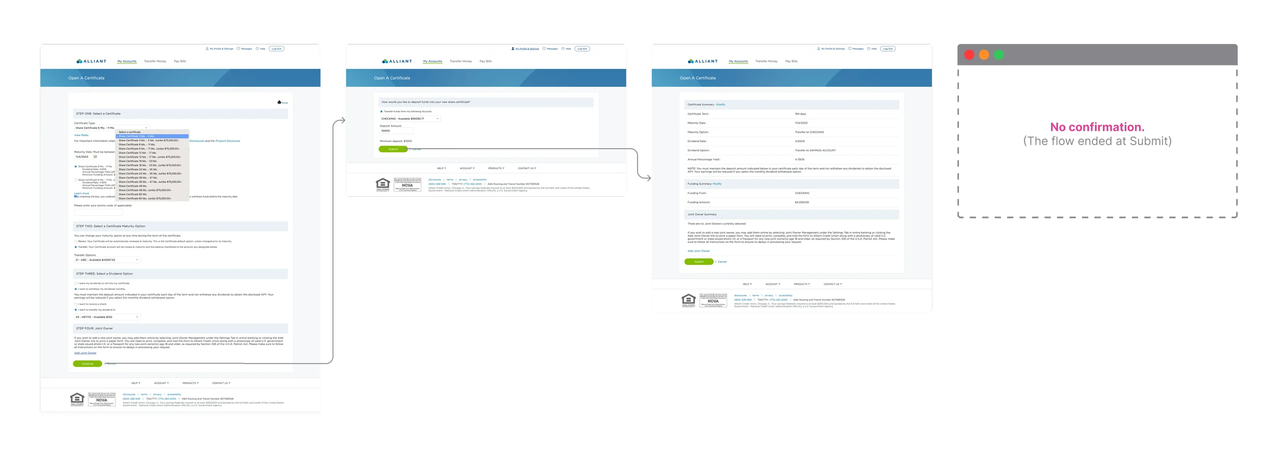
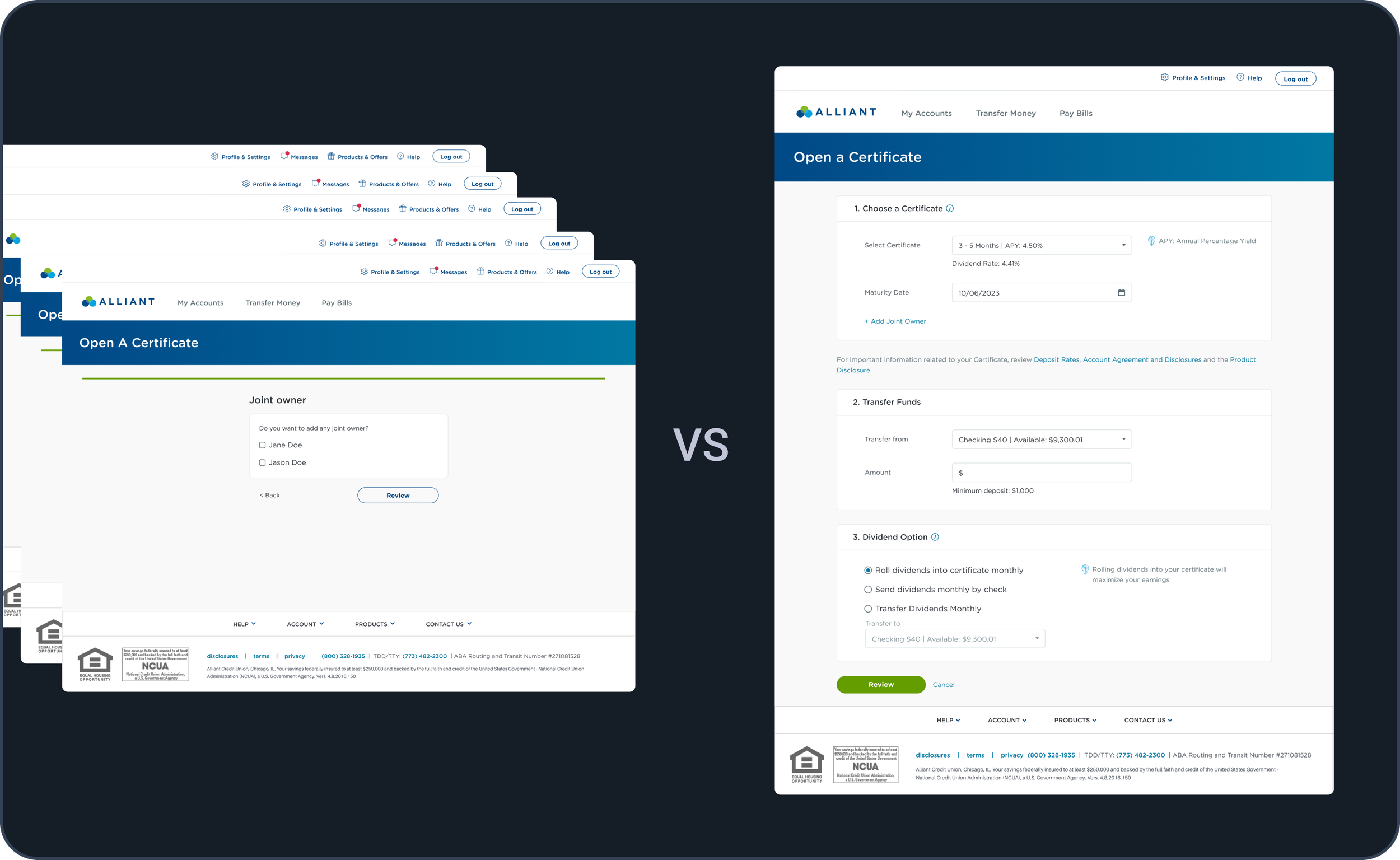
The old flow had friction at every place: unnecessary steps, poor information timing, no clear hierarchy, walls of text, and redundant clicks. To check rates, members left the flow. To add a joint owner, they had to print and mail a form. Everything competed for attention, and members gave up.
The following changes were the ones that moved the completion rate.
One page, instead of a Wizard
Testers felt more in control on One page and thought it was faster.
Fun fact: One page is actually 25% slower.
Other fixes
The prototype used for usability testing
Auto-renew by default
Members had to answer what happens at maturity before it mattered. I dropped the question and picked auto-renew for them.
Joint owners, inline
Adding existing co-owners became a checkbox. The paper path stayed only where regulation requires it.
Rates, in the term dropdown
Members left the flow to look up rates on the public site. Engineering piped the rate data in so members could see it while choosing a term.
Business comes first, of course.
But in finance, it only keeps working if members can see what's happening and know what to do next.
Other fixes
Sensible defaults, so most members just enter an amount
The flow pre-selects the popular term, funding account and dividend re-enrollment. In the simplest case, a member enters the amount, reviews, and submits.
3. Growing balance as the north $tar
Looking at it through a business lens, I started questioning what the team had taken for granted.

Internal funding only
→ External funding YES
An approach that no one questioned for decades.
$30M
New monthly external funding
Transparency & Guidance
I made every new CD default to auto-renew, without asking.
I knew that was a bit sketchy, so members see it stated plainly the moment they finish, with a link to change it.

The old flow with a 43% completion rate
Other fixes
Secure more CDs with $75,000 up funding
Members had to pick the Jumbo term twice, in the dropdown and again in a Jumbo radio group.
I merged that into one row with both rates, and checking the box takes the higher one.
All five testers could explain what the checkbox did. Jumbo openings on web went from about 1 in 8 to 1 in 6.
Impact summary
APY and dividends, in plain words
The flow assumed members knew what APY meant and how dividends worked. I put a short explanation next to each one, so nobody has to go looking halfway through.
The higher rate applies, checked or not
I went through every combination of the checkbox and the amount field. One of them shortchanged members who deposited enough but left the box unchecked. Now the higher rate applies either way, and the page tells them.
CD opening was improved.
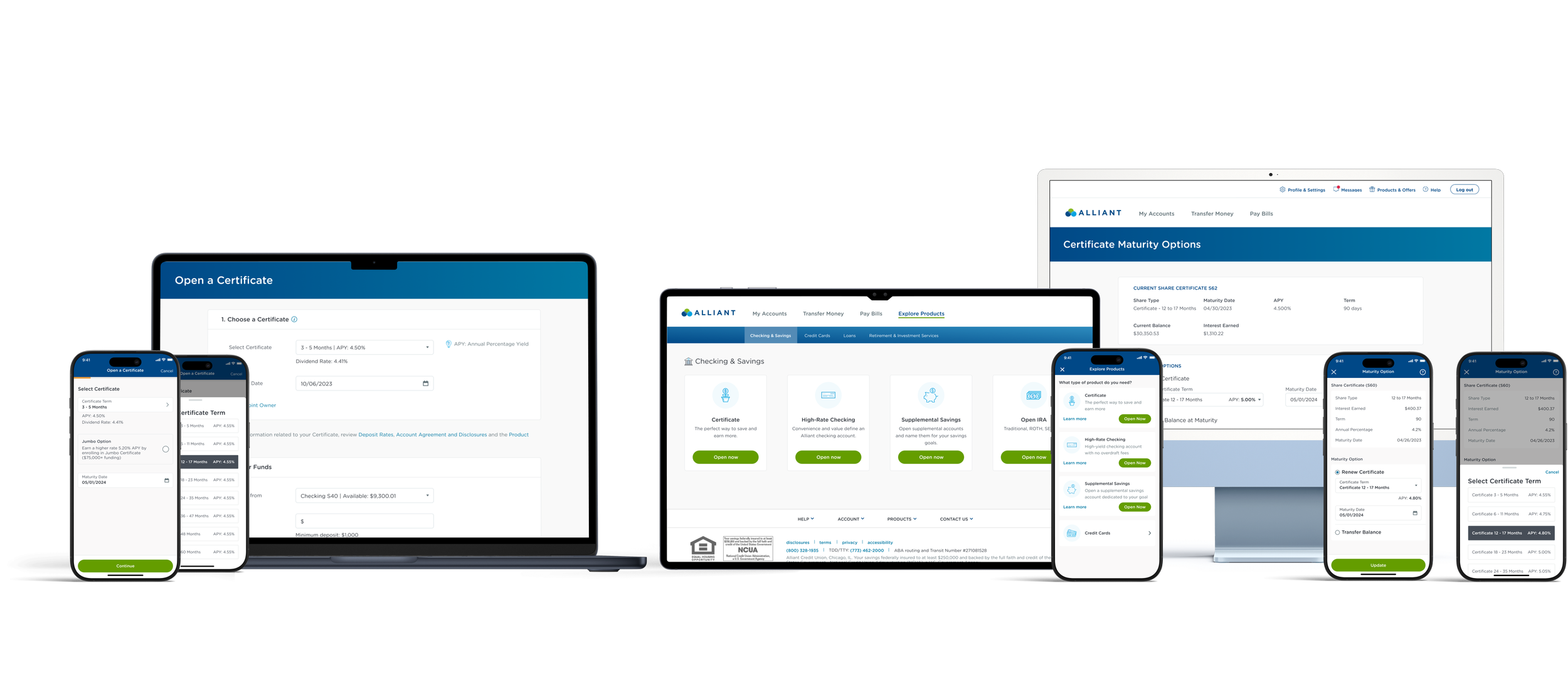
The same approach went to Renewal, Explore, and mobile.
Details are removed from the following considering the article length.
OTHER KEY TOUCHPOINTS
1. When CD is about to mature

Prompt
I introduced a new mechanism to prompt members to renew the CD.
Easy renew
I redesigned the renewing experience - it now takes 2 clicks.
35% → 61%
Auto-renewal flag
2. Discovering products
Findability
I designed and put a product explorer in the main navigation.
66%
More engagement
Bringing the success to mobile
CD Opening
43.5% of members are mobile-first. They could finally open a CD in the app.
CD Renewal
Explore Products
My works became part of the design system,
contributing to other products now.
Reflection
I never designed the cross-selling, and I wish I had.
When someone decides not to renew, that money leaves. An offer right then, checking or savings, might have kept some of it.
Compliance said no to an earnings calculator.
Members wanted to see what they'd actually make. Short definitions were as close as I could get them.